Feature Approach vs Thematic Approach in IB English Paper 1
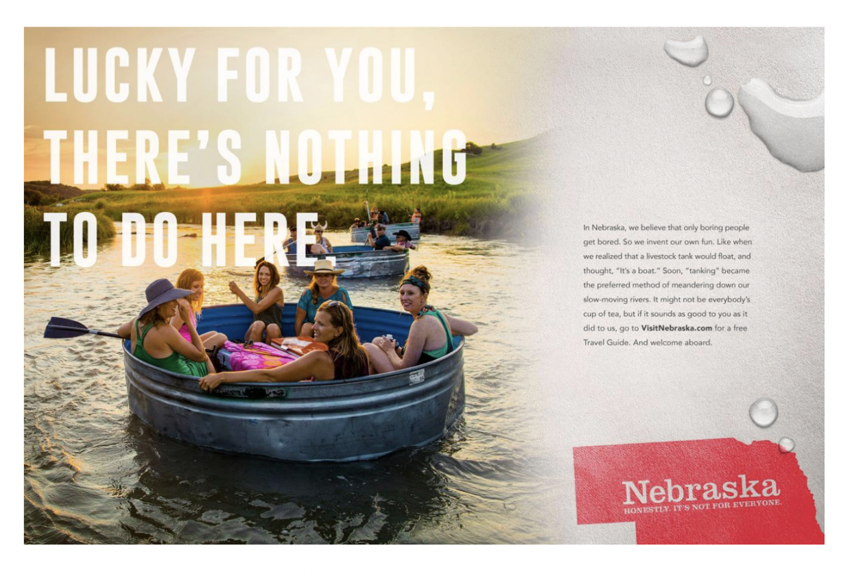
You can access the ad, here, at Visit Nebraska.
Feature Approach vs Thematic Approach in Paper 1
In IB English A Paper 1, strong analysis is not just about spotting techniques. It is about building a clear argument about how a text creates meaning. One of the easiest ways to improve your essay is to stop organising paragraphs around “features” and start organising them around “ideas.”
A feature approach organises paragraphs around techniques.
For example:
Paragraph 1: irony
Paragraph 2: image
Paragraph 3: slogan
Paragraph 4: typography
This can work, but you end up describing features instead of building an argument.
A thematic approach organises paragraphs around claims.
For example:
Paragraph 1: enjoyable
Paragraph 2: original
Paragraph 3: relaxing
Paragraph 4: honest
This is stronger because the claim leads, and the devices work for you like loyal little analysis minions.
The Difference: Features vs Themes
Feature approach: The device leads; the meaning follows.
Thematic approach: The meaning leads; the devices support.
The thematic approach is stronger because it puts meaning first, so the essay develops an argument instead of simply listing techniques.
Two Sample Essays
The two essays below analyse the same text, but they are organised differently: one by features, and one by themes. This makes it easier to see why the thematic approach often creates a clearer, more persuasive Paper 1 response.
Feature Approach
In tourism advertising, text and image often work together to make a destination appear desirable and distinct from its competitors. This Nebraska tourism advertisement challenges the common perception of the state as dull by turning that stereotype into a source of humour and curiosity. Aimed at potential travellers who may not normally consider Nebraska a holiday destination, the ad creates interest by presenting the state as unconventional. Ultimately, the text and image work together to intrigue the audience by transforming an apparently unappealing place into one that seems authentic, surprising, and worth exploring.
This sense of surprise is established first through the juxtaposition between the written message and the visual scene. The large headline states, “Lucky for you, there’s nothing to do here,” which appears negative at first because it repeats the stereotype that Nebraska is boring. However, the image immediately challenges this idea by showing a group of people smiling and floating together on a river. This contrast creates irony, as the text claims there is “nothing to do” while the image proves that people are actively enjoying themselves. The bold, oversized typography also acts as a form of visual emphasis, forcing the viewer to confront the strange claim before noticing how the photograph undermines it. As a result, the viewer is encouraged to pause and reconsider the meaning of the headline. Instead of accepting Nebraska as dull, the audience is drawn into the joke and becomes curious about why the ad would describe a fun-looking scene in such an unexpected way.
This unexpected presentation of enjoyment continues through the unusual activity shown in the image. The people are not using a traditional boat; they are floating in a large metal livestock tank. This visual choice uses novelty because livestock tanks are normally associated with farming rather than tourism. The body text explains that Nebraskans “invent our own fun” and discovered that “a livestock tank would float,” using anecdote to present the activity as a local invention. The tank also functions as symbolism, representing Nebraska’s rural identity while transforming that identity into recreation. Here, the text and image work together because the image first raises questions, while the written explanation provides context. This makes Nebraska seem quirky and original, encouraging the audience to see the state as a place where ordinary rural objects can become part of a memorable experience.
This memorable experience is made more appealing by the way the ad presents Nebraska’s slow pace as relaxing rather than boring. The body copy describes visitors “meandering down our slow-moving rivers,” using calming diction and sensory imagery to suggest relaxation and ease. This is reinforced by the visual atmosphere of the image. The river appears calm, the countryside is open, and the warm sunlight creates a peaceful mood. The soft lighting works as natural imagery, making the scene feel gentle and inviting. The people in the tank are leaning back and socialising rather than rushing or engaging in an intense activity, which creates a visual sense of stillness. This combination of language and image reframes slowness as a positive value. Instead of making Nebraska seem empty or uneventful, the ad suggests that its quietness offers a break from busier, more stressful environments.
This positive view of quietness also supports the advertisement’s self-aware and humorous tone. The slogan, “Nebraska. Honestly, it’s not for everyone,” is unusual for a tourism campaign because it does not try to present the destination as universally appealing. Instead, it admits that Nebraska may not suit all travellers. This use of self-deprecating humour makes the ad feel more honest and confident, as it does not rely on exaggerated claims. The simple layout and clear red Nebraska logo reinforce this straightforward tone through minimalism and branding. Visually, the ad avoids luxury imagery or dramatic landmarks, choosing instead a quirky and down-to-earth scene. This restraint creates authenticity, making the audience more likely to trust the message because Nebraska appears comfortable with its own identity.
This confident identity finally positions Nebraska as a destination for open-minded travellers. The phrase “only boring people get bored” uses direct challenge and humorous reversal, implying that the ability to enjoy Nebraska depends on one’s attitude. The image supports this by showing people who are clearly engaged, relaxed, and entertained by an unconventional activity. This combination encourages viewers to see themselves as adventurous and curious if they are willing to appreciate Nebraska’s unusual appeal. In this way, the ad does not simply sell a place; it sells a mindset. Through audience positioning, it suggests that Nebraska is interesting precisely because it does not follow typical expectations of tourism.
Overall, the ad’s most salient feature is the ironic contrast between “nothing to do” and the image of people having fun. This is effective because it turns a negative stereotype into humour, making Nebraska seem surprising and authentic. However, because media can both change and reinforce identity, the ad may also confirm Nebraska’s identity as rural, strange, or unexciting for viewers who already see it that way.
Thematic Approach
In tourism advertising, text and image often work together to make a destination appear desirable and distinct from its competitors. This Nebraska tourism advertisement challenges the common perception of the state as dull by turning that stereotype into a source of humour and curiosity. Aimed at potential travellers who may not normally consider Nebraska a holiday destination, the ad creates interest by presenting the state as unconventional. Ultimately, the text and image work together to intrigue the audience by transforming an apparently unappealing place into one that seems authentic, surprising, and worth exploring.
The advertisement first creates intrigue by making Nebraska’s supposed dullness appear unexpectedly entertaining. The large headline states, “Lucky for you, there’s nothing to do here,” which appears negative at first because it repeats the stereotype that Nebraska is boring. However, the image immediately challenges this idea by showing a group of people smiling and floating together on a river. This contrast creates irony, as the text claims there is “nothing to do” while the image proves that people are actively enjoying themselves. The bold, oversized typography also acts as a form of visual emphasis, forcing the viewer to confront the strange claim before noticing how the photograph undermines it. As a result, the viewer is encouraged to pause and reconsider the meaning of the headline. Instead of accepting Nebraska as dull, the audience is drawn into the joke and becomes curious about why the ad would describe a fun-looking scene in such an unexpected way.
The ad then deepens this curiosity by presenting Nebraska as a place where ordinary rural life becomes a source of originality. The people are not using a traditional boat; they are floating in a large metal livestock tank. This visual choice uses novelty because livestock tanks are normally associated with farming rather than tourism. The body text explains that Nebraskans “invent our own fun” and discovered that “a livestock tank would float,” using anecdote to present the activity as a local invention. The tank also functions as symbolism, representing Nebraska’s rural identity while transforming that identity into recreation. Here, the text and image work together because the image first raises questions, while the written explanation provides context. This makes Nebraska seem quirky and original, encouraging the audience to see the state as a place where ordinary rural objects can become part of a memorable experience.
The advertisement also makes Nebraska intriguing by redefining slowness as a desirable escape rather than a weakness. The body copy describes visitors “meandering down our slow-moving rivers,” using calming diction and sensory imagery to suggest relaxation and ease. This is reinforced by the visual atmosphere of the image. The river appears calm, the countryside is open, and the warm sunlight creates a peaceful mood. The soft lighting works as natural imagery, making the scene feel gentle and inviting. The people in the tank are leaning back and socialising rather than rushing or engaging in an intense activity, which creates a visual sense of stillness. This combination of language and image reframes slowness as a positive value. Instead of making Nebraska seem empty or uneventful, the ad suggests that its quietness offers a break from busier, more stressful environments.
The ad further sustains interest by constructing Nebraska’s identity as honest, self-aware, and comfortable with being different. The slogan, “Nebraska. Honestly, it’s not for everyone,” is unusual for a tourism campaign because it does not try to present the destination as universally appealing. Instead, it admits that Nebraska may not suit all travellers. This use of self-deprecating humour makes the ad feel more honest and confident, as it does not rely on exaggerated claims. The simple layout and clear red Nebraska logo reinforce this straightforward tone through minimalism and branding. Visually, the ad avoids luxury imagery or dramatic landmarks, choosing instead a quirky and down-to-earth scene. This restraint creates authenticity, making the audience more likely to trust the message because Nebraska appears comfortable with its own identity.
Finally, the advertisement presents Nebraska as a destination for open-minded travellers who are willing to find enjoyment in unexpected places. The phrase “only boring people get bored” uses direct challenge and humorous reversal, implying that the ability to enjoy Nebraska depends on one’s attitude. The image supports this by showing people who are clearly engaged, relaxed, and entertained by an unconventional activity. This combination encourages viewers to see themselves as adventurous and curious if they are willing to appreciate Nebraska’s unusual appeal. In this way, the ad does not simply sell a place; it sells a mindset. Through audience positioning, it suggests that Nebraska is interesting precisely because it does not follow typical expectations of tourism.
Overall, the ad’s most salient feature is the ironic contrast between “nothing to do” and the image of people having fun. This is effective because it turns a negative stereotype into humour, making Nebraska seem surprising and authentic. However, because media can both change and reinforce identity, the ad may also confirm Nebraska’s identity as rural, strange, or unexciting for viewers who already see it that way.