
IB English Paper 1 — Smooth Transitions
Access this ad at The Earthbound Report
Criterion C: Smooth Transitions
One of the biggest differences between an average IB English Paper 1 response and a high‑scoring one isn’t just deeper analysis, it’s flow.
Under Criterion C (Focus, Organisation and Development), examiners reward essays that are logically organised and cohesive. This means your ideas should build naturally on one another, rather than reading like a checklist of techniques.
Smooth transitions show that you understand how the text works as a whole, not just in isolated parts. Instead of jumping from layout to colour to imagery, stronger responses clearly demonstrate how each feature develops or reinforces the previous one.
Here’s an essay that moves between paragraphs in a way that feels natural rather than forced, showing how each new point grows organically out of the previous one. As you read, notice how subtle shifts in phrasing connect ideas and turn separate observations into one cohesive, high‑scoring argument.
Essay
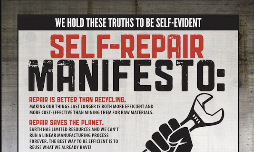
In today’s world, many people find it difficult to repair the technology they own, as companies often restrict access to parts, tools, and repair information. The 2013 promotional poster “Self‑Repair Manifesto,” created and published by iFixit, encourages consumers to take control of their devices by embracing self‑repair through iFixit’s guides, tools, and replacement parts. Using bold statements like “We have the right to…” alongside the powerful image of a raised fist gripping a wrench, the poster presents repair as both a personal right and a practical choice.
This idea is strengthened through the poster’s manifesto-style layout, which amplifies the importance and urgency of its message. By calling itself a “Self‑Repair Manifesto” and using large, capitalised headings, it immediately sounds like a public declaration rather than a sales pitch. This gives the argument a sense of authority and seriousness, encouraging readers to see repair as a principle, not just a practical option. The opening line, “WE HOLD THESE TRUTHS TO BE SELF‑EVIDENT,” echoes famous political documents, which subtly links the idea of repair to democratic rights and shared values. This makes the message feel legitimate and morally grounded, even though it is ultimately promoting a company.
Building on this sense of credibility, the structure of the layout further reinforces the effect. The bold subheadings followed by short explanations resemble a list of beliefs or demands, making the ideas easy to follow and feel definitive. The extensive listing of benefits and rights strengthens this impact, as the accumulation of points creates momentum and suggests that the case for repair is comprehensive and difficult to refute. With little space for counterargument, repair is presented as logical and necessary. When the poster shifts to “WE HAVE THE RIGHT:”, the tone becomes even stronger, framing repair as an entitlement rather than an option. This creates a sense of empowerment and mild resistance, while subtly directing that energy toward iFixit’s services and blending activism with branding to enhance its persuasive impact.
That same sense of authority carries through in the poster’s typography. The use of heavy, capitalised block lettering immediately captures attention and conveys confidence and authority. Phrases such as “SELF‑REPAIR MANIFESTO” are presented in bold uppercase text, giving them a declarative and uncompromising tone. This stylistic choice mirrors political slogans and public declarations, making the statements feel firm and definitive rather than open to debate. The consistent use of large headings followed by smaller explanatory text also creates a clear hierarchy, guiding the reader through the argument in a controlled and deliberate way. As a result, the font shapes the message as assertive, principled, and commanding.
Alongside the typography, the colour palette intensifies the overall impact. The selective use of red against a predominantly black‑and‑white background heightens the emotional intensity of the message. Red is commonly associated with urgency, passion, and activism, so its placement on key phrases draws the reader’s eye and reinforces the idea that repair requires immediate attention. In contrast, the black text introduces a more neutral and measured tone, enhancing readability and presenting the supporting arguments as rational and considered. The grey border surrounding the poster is a muted, industrial tone that evokes metal and machinery, subtly reinforcing the theme of tools and repair while framing the content in a way that feels structured and contained. Together, these colour choices create contrast and emphasis, strengthening the poster’s authoritative and persuasive tone.
Tying these elements together visually is the central image of a raised fist gripping a wrench. The raised fist is a widely recognised symbol of resistance, solidarity, and collective action, often associated with social and political movements. By replacing a protest sign or weapon with a wrench, the poster redefines repair as an act of empowerment rather than mere maintenance. This visual metaphor elevates the practical act of fixing a device into a symbolic stand against restriction and corporate control. The large scale and bold, simplified design of the image ensure it dominates the page, immediately drawing attention and creating emotional impact. As a result, the image does more than illustrate repair; it frames it as a form of resistance, encouraging readers to feel empowered and aligned with the cause.
This sense of empowerment is further reinforced through the poster’s language. It presents repair as a responsible and principled choice, especially in statements like “Repair saves the planet,” which frame the act as environmentally conscious and socially aware. The confident, matter‑of‑fact tone makes these claims sound authoritative and difficult to dispute. At the same time, phrases such as “limited resources” and the slogan “If you can’t fix it, you don’t own it” stir emotion by creating concern and even a sense of unfairness. The direct address in “saves you money” makes the message feel personal, showing readers how they would benefit directly. Alongside this, references to efficiency and cost‑effectiveness appeal to common sense, presenting repair as a practical and logical decision. Overall, the language is effective because it blends moral conviction with emotional engagement and practical reasoning, making the argument feel both compelling and difficult to dismiss.
Taken together, these elements make the text effective in persuading its audience to engage with iFixit’s services because it frames repair as empowering, responsible, and financially sensible through its bold design and confident language. However, the dramatic tone and absolute claims can make a simple consumer choice feel like a full‑blown political battle, which may cause some readers to feel sceptical or push back rather than immediately agree.