
Paper 1 (May 2018) — Multimodal Response
You can find the article here.
GQ: In what ways does the interplay of image, layout and language help the guide to achieve its purpose?
This text is a promotional travel guide about Tasmania’s caves, commenting on their natural beauty and unique underground experiences. It is targeted at potential tourists, specifically those who are seeking adventure or an escape from busy modern life. The purpose is to persuade readers to visit Mole Creek Karst National Park by presenting the caves as exciting, beautiful and refreshing places to explore. This aim is accomplished through the combined use of striking images, a clear and engaging layout, and vivid, persuasive language that together attract attention, create interest and build trust with the reader.
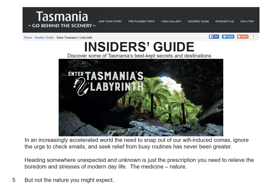
The images immediately capture the reader’s attention and help create a strong sense of atmosphere. The main banner image, which says “Enter Tasmania’s Labyrinth,” suggests mystery and adventure. The dark cave entrance and bright green plants create contrast, making the place look both beautiful and unknown. This supports the idea in the text that visitors can discover something hidden and special. The image of the glow-worms shining in the dark cave creates a magical and peaceful atmosphere. The contrast between the deep darkness and the tiny blue lights makes the cave feel mysterious and almost otherworldly. This strong visual mood helps readers imagine the quiet, still environment underground and makes the description of caves where “things glow brighter without light” feel more vivid and believable. As a result, the experience seems unique and enchanting, encouraging readers to want to see it for themselves. The wide shot of a small figure inside the vast cave, illuminated by golden, reflective light, emphasises its immense scale and creates a warm, awe-inspiring atmosphere that makes the experience seem both humbling and unforgettable. By placing the images next to related parts of the text, the guide helps readers clearly connect what they are reading with what they are seeing.
The layout of the guide also helps it achieve its purpose. The bold heading “INSIDERS’ GUIDE” makes readers feel like they are getting special or exclusive information. Directly beneath it, the large, top-centred feature image immediately captures attention and establishes the adventurous and mysterious tone of the guide. The exotic, stylised font used in the banner text, particularly in phrases like “Tasmania’s Labyrinth,” reinforces this sense of mystery and discovery, giving the destination a unique and almost mythical quality. By positioning this image and distinctive typography prominently at the top of the page, the guide ensures readers are visually engaged before they even begin reading in detail. Clear subheadings, such as “MOLE CREEK KARST NATIONAL PARK,” organise the information and make it easy to follow. The paragraphs are short and spaced out, which makes the page less overwhelming and easier to read. The images are placed throughout the text instead of at the end, keeping readers engaged and helping them connect the descriptions to real visuals. The clean structure, consistent font and balanced use of white space guide the reader’s eye smoothly down the page, making the information feel clear and accessible. Overall, the layout works with the images and language by placing striking visuals directly beside vivid descriptions, so readers experience the emotional language and the atmospheric imagery at the same time, intensifying feelings of wonder and adventure and making the destination seem more compelling and desirable.
The language used in the guide is descriptive and persuasive, combining emotional appeal with factual detail to strengthen its impact. By addressing the reader directly through words like “you,” the writer makes the experience feel personal and immersive, encouraging readers to picture themselves inside the caves rather than simply reading about them. Sensory imagery such as “time is measured by drips of water” slows the pace of the writing and creates a calm, reflective mood, while “pitch-black walls like city lights turning on at dusk” transforms the cave into something magical and visually striking, increasing its appeal. The comparison to walking into a “David Jones store” makes the cool cave air feel familiar and refreshing, helping readers relate the unknown environment to a common experience. The contrast between stressful modern life, described negatively as “wifi-induced comas,” and the peaceful underground world positions the caves as a cure for routine and pressure, making the destination seem necessary rather than optional. Finally, the inclusion of specific statistics about the caves’ depth, length and number adds authority and credibility, reassuring readers that the guide is reliable and that the experience it promotes is both real and impressive. By blending escapist imagery with measurable facts, the guide carefully balances emotional desire with logical reassurance, making the decision to visit feel both inspiring and sensible rather than impulsive.
In conclusion, while the guide uses image, layout and language to persuade readers to visit Tasmania’s caves, its language is the most persuasive element. The vivid and immersive descriptions encourage readers to imagine themselves inside the caves, creating a strong emotional connection and making the experience feel transformative rather than simply recreational. However, the guide’s highly descriptive and promotional tone may be slightly less effective for some of the target audience because it can seem exaggerated, which may reduce its credibility for more skeptical readers.