
Paper 1 Essay & How to Craft the Conclusion
Access the infographic here.
How to Craft the Conclusion
When writing the conclusion of a Paper 1 essay, many students automatically start with “In conclusion” and simply restate their thesis. While this is safe, it can make the ending feel basic. A stronger conclusion also gives a brief evaluation.
After you restate your main argument, try adding a “However, …” sentence that highlights a weakness in the text’s persuasive techniques. This shows deeper thinking and helps your analysis stand out.
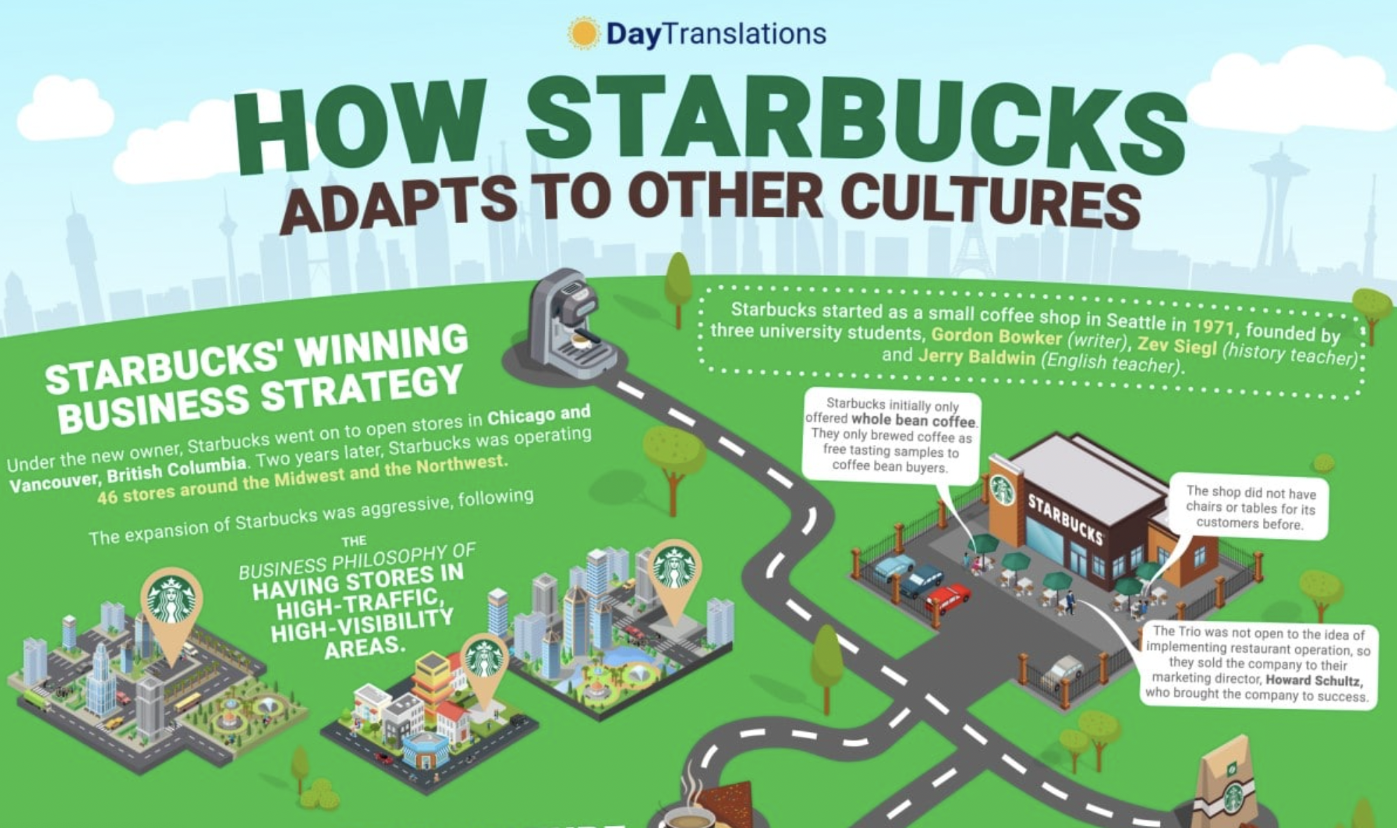
For example, you might explain that although the text persuades its audience through clear logic and strong evidence, its credibility is not clearly shown. In the infographic above, the visuals and statistics strengthen the logic but may distract from the company’s authority.
By showing both what the text does well and where it is weaker, your conclusion demonstrates a stronger understanding of persuasion and can push your essay into the higher mark bands.
Check out the conclusion below and notice how it addresses the text’s limitations, especially how it fails to fully reach its target audience.
Essay
In an increasingly globalised economy, Day Translations’ infographic and blog post “How Starbucks Adapts to Other Cultures” uses Starbucks’ international success to persuade businesses to expand globally through professional localization services. Although the text appears informative, it functions primarily as a promotional piece, reframing translation as cultural expertise rather than simple linguistic fluency. Targeted at business owners seeking international growth, the infographic characterises Starbucks as adaptable, innovative, and culturally intelligent, thereby reflecting Day Translations as knowledgeable, reliable, and essential to global expansion. Through co-branding, statistical evidence, cultural case studies, and symbolic visual design, the text constructs localization as the foundation of international success.
To persuade businesses that localization expertise leads to global success, the text employs co-branding to align Day Translations with Starbucks’ established reputation. By adopting Starbucks’ signature green, brown, and white colour palette and prominently featuring its name at the top of the infographic, the design visually associates Day Translations with a globally recognised corporation. The Starbucks logo and branding elements in the upper section immediately capture attention, functioning as a visual anchor for credibility. This reputation transfer strengthens perceived authority and reliability, while the bold, capitalised headline reinforces Starbucks as a model of achievement. For business owners considering overseas markets, this association is persuasive because it suggests that Day Translations possesses insider knowledge of how major global brands succeed.
To further convince its audience that global expansion is profitable and attainable, the text uses statistical evidence and ranking structures to highlight Starbucks’ scale. By citing “Statista’s latest data” and listing 29,324 stores across 73 countries, the infographic relies on measurable proof. Graphically, the statistics are placed in a distinct section with large numerals, bright icons, and “Top 10 Countries” rankings, creating a clear visual hierarchy that draws the eye. The award-style symbols and organized country lists reinforce dominance and popularity. This structured presentation implies that international growth is common among leading corporations. For business owners, the combination of bold visuals and precise data is persuasive because it frames expansion as a proven, evidence-based strategy rather than a speculative risk.
To reinforce its purpose of presenting localization as essential to international success, the text incorporates cultural case studies that demonstrate adaptation in practice. Examples such as hiring local designers in Japan, redesigning Chinese stores for group seating, and modifying the logo in Saudi Arabia illustrate practical sensitivity to local customs. Visually, these examples are supported by small, country-specific icons and 3D illustrations of store designs, which make the adaptations concrete rather than abstract. The repetition of terms like “localization” and “adapt” strengthens the semantic focus on cultural awareness. For businesses concerned about entering unfamiliar markets, these realistic graphics and detailed examples are persuasive because they show that cultural adaptation is achievable and strategically implemented.
To make international expansion appear manageable and appealing, the text uses symbolic visual design to represent growth and opportunity. The infographic places a developed cityscape in the top third of the page, while the remaining two-thirds show expansion spreading outward beneath it, creating a visual metaphor of growth from local success to global reach. A winding road branches into different regions, symbolising international expansion, while the open green landscape connotes prosperity and possibility. This structured layout simplifies the concept of entering new markets. For business owners, this is persuasive because it frames global growth as a clear and natural progression, one that Day Translations can help guide.
Overall, the infographic effectively markets Day Translations by using Starbucks’ global success as a model for international business expansion through strategic co-branding, authoritative statistical evidence, culturally specific case studies, and symbolic visual metaphors of growth and expansion. However, its heavy reliance on Starbucks’ branding and success risks overshadowing Day Translations itself, potentially causing the audience to focus more on Starbucks’ achievements than on the specific services and unique value that Day Translations provides.