
IB English Paper 1 Tip: Mastering the Concluding Evaluation (M25 Website)
Viist the Website here.
If you want to move from a good Paper 1 response to a top‑band one, your concluding evaluation is crucial.
Many students stop at analysis. They identify devices. They explain effects. But IB examiners are looking for something more: overall evaluation of how the text works for its audience and purpose.
So What Is a Concluding Evaluation?
A concluding evaluation is the final sentence (or two) of your paragraph that:
Returns to your topic sentence
Reinforces how the text frames the subject
Links clearly to the audience’s needs, desires, or expectations
Shows you understand the writer’s broader purpose
It moves your paragraph from analysis to interpretation and evaluation.
What Strong Concluding Evaluations Do
Strong concluding evaluations answer one key question:
So what? Why does this framing matter?
For example:
Instead of ending with:
This makes the experience seem exciting.
Upgrade it to:
By framing the experience as exciting and prestigious, the website reassures tourists that it is both memorable and worth prioritising during their visit.
See the difference?
The second version:
Echoes the framing
Connects to audience needs
Shows awareness of purpose (persuasion, marketing, influence)
That’s what examiners reward.
The Formula You Can Use in the Exam
If you’re unsure how to structure your evaluation, use this template:
By framing ___ as ___, the text appeals to ___ and fulfils their need for ___.
Or:
Ultimately, this framing positions ___ as ___, reinforcing the text’s purpose to ___.
These structures help ensure you’re linking framing + audience + purpose in one clear sentence.
Common Mistakes to Avoid
❌ Repeating earlier analysis
❌ Introducing new devices
❌ Making vague statements like “This is effective”
❌ Forgetting the audience
Your conclusion should synthesise, not summarise.
Why It Matters
Paper 1 rewards students who demonstrate conceptual understanding, not just device spotting.
A strong concluding evaluation proves you understand:
How meaning is constructed
How framing shapes interpretation
How texts are designed to influence audiences
That’s what pushes you into the 6–7 range.
Next time you practise Paper 1, evaluate the framing and link it to audience impact.
That’s the move that impresses examiners.
Essay Outline
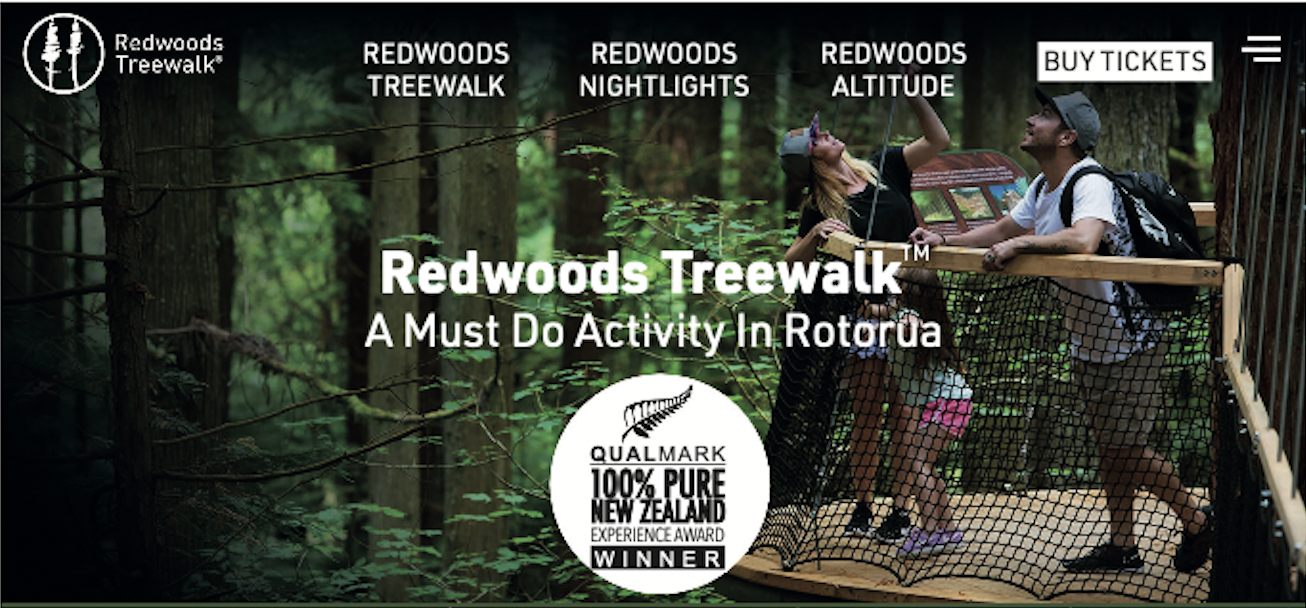
1. Header / Hero Section
Topic Sentence:
The Website initially frames Redwoods Treewalk as a prestigious and must‑do attraction, establishing credibility and capturing the audience’s attention.
Evidence & Analysis:
“A Must Do Activity In Rotorua”
Device (Textual): Emotive / promotional language
Evaluation: The phrase strongly persuades by presenting the experience as essential rather than optional.
Interpretation: It implies that visitors would miss out if they did not participate.
“Qualmark 100% Pure New Zealand Experience Award Winner”
Device (Textual): Appeal to authority
Evaluation: Referencing an official award builds credibility and trust.
Interpretation: It suggests the experience is nationally recognised and high quality.
Large image of visitors on a suspended forest bridge
Device (Visual): Visual imagery
Evaluation: The elevated perspective captures attention and creates excitement.
Interpretation: It frames the Treewalk as adventurous yet safe.
Prominent display of logo and award badge
Device (Visual): Symbolism / branding
Evaluation: The bold placement reinforces professionalism and legitimacy.
Interpretation: The experience is framed as reputable and well‑established.
Concluding Evaluation:
By presenting the Treewalk as both prestigious and essential through authoritative credentials and striking imagery, the header successfully captures attention while reassuring tourists that this is a credible attraction worth prioritising.
2. Welcome Section
Topic Sentence:
Building on this credibility, the welcome section deepens the appeal by framing the Treewalk as a magical and immersive escape from everyday life.
Evidence & Analysis:
“Welcome to our wonderland”
Device (Textual): Metaphor
Evaluation: Comparing the forest to a “wonderland” creates fantasy and enchantment.
Interpretation: The Treewalk is framed as an extraordinary escape.
“Extraordinary by day, mesmerising by night”
Device (Textual): Contrast
Evaluation: Highlights variety and dual appeal.
Interpretation: Frames the experience as consistently impressive at any time.
Dark forest and starry background
Device (Visual): Atmospheric imagery
Evaluation: The dim lighting and stars create mystery.
Interpretation: Reinforces the magical tone.
Silhouetted treetops against the night sky
Device (Visual): Visual contrast
Evaluation: The contrast between darkness and subtle light enhances drama.
Interpretation: Frames the forest as vast and enchanting.
Concluding Evaluation:
By combining imaginative language with immersive visual atmosphere, the section strengthens this framing of the Treewalk as a magical escape, appealing to visitors seeking wonder and emotional transformation.
3. Daytime Treewalk™ Section
Topic Sentence:
Having established its enchantment, the website then specifically frames the Daytime Treewalk as a peaceful yet awe‑inspiring way to experience the forest.
Evidence & Analysis:
“Breathtaking. Immersive. Extraordinary.”
Device (Textual): Rule of three
Evaluation: The rhythmic structure intensifies emphasis.
Interpretation: Frames the experience as powerful and memorable.
“A peaceful haven”
Device (Textual): Positive connotation
Evaluation: Suggests calmness and escape.
Interpretation: Frames the Treewalk as restorative and relaxing.
Bright green forest imagery
Device (Visual): Colour symbolism
Evaluation: Vibrant greens create a sense of freshness and vitality.
Interpretation: Frames the environment as healthy and serene.
Visitors shown safely walking on wide platforms
Device (Visual): Framing and composition
Evaluation: The stable structures appear secure and accessible.
Interpretation: Frames the experience as safe and suitable for families.
Concluding Evaluation:
Through calming descriptions and reassuring imagery, the daytime section reinforces this framing of the Treewalk as both peaceful and awe‑inspiring, meeting visitors’ need for relaxation alongside natural grandeur.
4. Nightlights Treewalk™ Section
Topic Sentence:
In contrast to the calm serenity of the day experience, the Nightlights section reframes the Treewalk as a dramatic and transformative nighttime spectacle.
Evidence & Analysis:
“Enchanting. Magical. Mesmerising.”
Device (Textual): Rule of three
Evaluation: Builds intensity and rhythm.
Interpretation: Frames the experience as spellbinding.
“Forest comes to life”
Device (Textual): Personification
Evaluation: Makes the forest seem animated.
Interpretation: Frames the Treewalk as transformative and alive.
Illuminated walkway against dark forest
Device (Visual): Contrast (light vs dark)
Evaluation: The glowing lights create dramatic impact.
Interpretation: Frames the night walk as visually spectacular.
Curved, glowing bridge design
Device (Visual): Shape and design aesthetics
Evaluation: The sweeping curves appear artistic and futuristic.
Interpretation: Frames the experience as unique and modern.
Concluding Evaluation:
By emphasising transformation through vivid language and dramatic lighting, the section fully realises this framing of the Treewalk as a spectacular nighttime experience that offers something distinct from the daytime walk..
5. Prices Section
Topic Sentence:
Finally, after highlighting both the emotional and sensory appeal of the experience, the pricing section grounds the promotion by framing the Treewalk as accessible, flexible, and family‑friendly.
Evidence & Analysis:
“Children under 5: FREE”
Device (Textual): Capitalisation for emphasis
Evaluation: Immediately draws attention.
Interpretation: Frames the experience as family‑friendly.
“Day OR Night / Day AND Night Combo”
Device (Textual): Contrast and choice
Evaluation: Highlights flexibility and added value.
Interpretation: Frames the Treewalk as adaptable to visitor preferences.
Structured price layout in bold, clear font
Device (Visual): Layout and typography
Evaluation: Easy‑to‑read formatting builds transparency.
Interpretation: Frames the business as trustworthy and organised.
Warm brown wood-toned background
Device (Visual): Colour symbolism
Evaluation: Earthy tones reinforce natural branding.
Interpretation: Connects pricing with the forest theme.
Concluding Evaluation:
By clearly presenting flexible options and transparent costs, the pricing section reinforces this framing of the Treewalk as accessible and family‑friendly, ensuring the experience feels attainable as well as desirable.
Essay
The Redwoods Treewalk website carefully constructs a persuasive representation of the attraction by progressively framing it as prestigious, magical, immersive, and ultimately accessible. Through a balanced combination of textual and visual techniques, the website guides its audience from initial trust and excitement to emotional engagement and finally to practical reassurance, ensuring the experience feels both desirable and attainable.
The website initially frames Redwoods Treewalk as a prestigious and must‑do attraction, establishing credibility and capturing the audience’s attention. The phrase “A Must Do Activity In Rotorua” employs emotive and promotional language, strongly persuading readers by presenting the experience as essential rather than optional, implying that visitors would miss out if they did not participate. This sense of urgency is reinforced by the inclusion of “Qualmark 100% Pure New Zealand Experience Award Winner,” an appeal to authority that builds credibility and trust, suggesting that the attraction is nationally recognised and of high quality. Visually, a large image of visitors standing on a suspended forest bridge uses striking imagery to capture attention; the elevated perspective creates excitement while simultaneously portraying the structure as stable and secure, framing the Treewalk as adventurous yet safe. The prominent display of the official logo and award badge further operates as visual symbolism, reinforcing professionalism and legitimacy and framing the experience as reputable and well‑established. By presenting the Treewalk as both prestigious and essential through authoritative credentials and compelling imagery, the header successfully captures attention while reassuring tourists that this is a credible attraction worth prioritising.
Building on this credibility, the welcome section deepens the appeal by framing the Treewalk as a magical and immersive escape from everyday life. The metaphor “Welcome to our wonderland” compares the forest to a fantasy realm, creating enchantment and positioning the Treewalk as an extraordinary escape. Similarly, the contrast in “Extraordinary by day, mesmerising by night” highlights variety and dual appeal, framing the experience as consistently impressive regardless of timing. The visual design reinforces this tone: a dark forest and starry background employs atmospheric imagery to create mystery, while silhouetted treetops against the night sky use visual contrast to enhance drama and scale, framing the forest as vast and enchanting. By combining imaginative language with immersive visual atmosphere, the section strengthens the framing of the Treewalk as a magical escape, appealing to visitors seeking wonder and emotional transformation rather than a routine tourist activity.
Having established its enchantment, the website then specifically frames the Daytime Treewalk as a peaceful yet awe‑inspiring way to experience the forest. The rule of three in “Breathtaking. Immersive. Extraordinary.” creates rhythmic emphasis, intensifying the description and framing the experience as powerful and memorable. In contrast, the phrase “a peaceful haven” carries positive connotations of calmness and retreat, framing the Treewalk as restorative and relaxing. The bright green forest imagery reinforces this mood through colour symbolism, as vibrant greens evoke freshness, vitality, and environmental purity, framing the setting as healthy and serene. Additionally, visitors are shown safely walking on wide platforms, and this careful visual composition presents the structures as stable and accessible, framing the experience as suitable for families and cautious travellers alike. Through calming descriptions and reassuring imagery, the daytime section reinforces the framing of the Treewalk as both peaceful and awe‑inspiring, meeting visitors’ need for relaxation alongside natural grandeur.
In contrast to the calm serenity of the day experience, the Nightlights section reframes the Treewalk as a dramatic and transformative nighttime spectacle. The rule of three in “Enchanting. Magical. Mesmerising.” builds intensity and rhythm, framing the experience as spellbinding. Personification in the phrase “Forest comes to life” animates the environment, framing the Treewalk as transformative and alive rather than static. Visually, the illuminated walkway against the dark forest uses strong contrast between light and shadow to create dramatic impact, framing the night walk as visually spectacular. The curved, glowing bridge design further contributes through its distinctive shape and aesthetic appeal; the sweeping curves appear artistic and futuristic, framing the experience as unique and modern. By emphasising transformation through vivid language and dramatic lighting, the section fully realises this framing of the Treewalk as a spectacular nighttime experience that offers something distinct from the daytime walk.
Finally, after highlighting both the emotional and sensory appeal of the experience, the pricing section grounds the promotion by framing the Treewalk as accessible, flexible, and family‑friendly. The capitalisation in “Children under 5: FREE” immediately draws attention, framing the experience as welcoming to families. The contrast and choice in “Day OR Night / Day AND Night Combo” highlight flexibility and added value, framing the Treewalk as adaptable to visitor preferences and budgets. Visually, the structured price layout in bold, clear font uses effective typography and organisation to enhance readability, framing the business as transparent and trustworthy. The warm brown wood‑toned background employs colour symbolism, reinforcing natural branding and connecting the pricing information to the forest theme established earlier. By clearly presenting flexible options and transparent costs, the pricing section reinforces the framing of the Treewalk as accessible and family‑friendly, ensuring the experience feels attainable as well as desirable.
Overall, the website constructs a carefully layered promotional narrative from establishing prestige and credibility, deepening engagement through magical framing, differentiating between serene daytime and dramatic nighttime experiences, and concluding by reassuring visitors of value and accessibility. Through this deliberate progression of textual and visual strategies, Redwoods Treewalk is consistently framed not merely as a walk through trees, but as an essential, transformative, and achievable experience tailored to meet both the emotional and practical needs of its audience.