
The Language of Graphics in The Gate Theatre’s Manifesto (IB English May 2025 past paper 1)

The Gate Theatre Manifesto (click here)
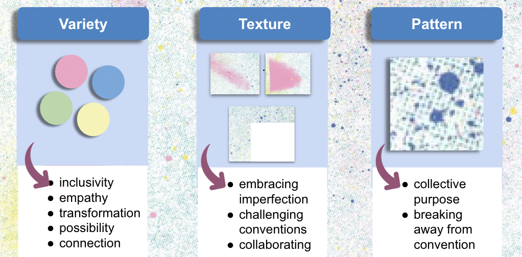
When we think of manifestos, we often focus on their words, the bold declarations, urgent calls to action, and visionary ideals. But what if the visuals are speaking just as loudly? In this post, I dive into the graphic language of a contemporary theatre manifesto, from The Gate, unpacking how its color palette, texture, and pattern work in concert with its text to communicate its core values: inclusivity, empathy, transformation, and collective imagination.
Color: A Pastel Palette with Purpose
At first glance, the background is awash in soft pastels: pink, yellow, blue, and green. These aren’t just pretty choices; they’re strategic signals.

Diversity through hue:
The presence of four distinct pastel tones visually echoes the manifesto’s commitment to inclusivity. This isn’t a monochrome vision, it’s a spectrum. That diversity mirrors lines like “Our artists are international. Our shows are multilingual,” affirming a global, polyvocal theatre community.
Empathy through softness:
All these colors are low in saturation, creating a gentle, calming aesthetic. This quiet visual tone aligns with the manifesto’s empathetic stance, especially evident in the line “Acknowledge and hold the suffering of the past.” The muted palette doesn’t shout; it listens.
Each color also carries symbolic weight:
Pastel pink evokes playfulness and imagination, qualities central to the manifesto’s embrace of theatrical experimentation. It’s the visual counterpart to the invitation: “Make space for what might be.”
Pastel yellow radiates optimism, reinforcing the forward-looking spirit of “A Manifesto for our Future.” It’s hopeful without being naive.
Pastel blue conveys trust and stability. In a document that boldly declares “We declare a climate emergency,” this hue grounds the urgency in reliability; this isn’t performative activism, but a credible call to action.
Pastel green suggests growth, renewal, and harmony, perfect for a text that champions transformation, interconnectedness, and reimagined futures.
Together, these colors don’t just decorate, they declare.
Texture: Celebrating the Messy

Beneath the colors lies a halftone texture, grainy, imperfect, almost tactile. This isn’t a sleek corporate design; it’s intentionally rough around the edges.
That rawness directly reflects the manifesto’s embrace of “the mess and imperfection of humanity.” Rather than striving for polished perfection, the texture honors complexity, contradiction, and lived experience.
Interspersed are smears of color, organic, uncontrolled bursts that disrupt any sense of rigid order. These visual ruptures echo the manifesto’s directive to “radically interrogate” texts from before 2010, challenging inherited canons and unexamined traditions. The smears are rebellion in pigment form.
And then there’s the juxtaposition of abstract texture against clean white space. This contrast isn’t accidental, it visualizes collaboration. Just as the manifesto insists “Everyone in the room is part of the show (this includes the audience),” the design merges chaos and clarity, performer and spectator, creator and community.
Pattern: Structure and Subversion in Tandem

Look closer, and you’ll notice two key patterns at play:
A subtle grid of aligned dots, orderly, rhythmic, pointing in unison. This structure symbolizes interconnectedness and collective purpose, visually reinforcing the rallying cry: “We can’t do this without you.”
It’s a reminder that even in radical art, there’s power in shared direction.
Randomly scattered speckles that break from the grid, chaotic, spontaneous, defiant. These embody the manifesto’s challenge to “Look outside what you know,” urging us to question rigid frameworks and embrace new perspectives.
The genius lies in their coexistence: structure and subversion aren’t opposites here, they’re partners. Just as the manifesto balances urgent declarations with open-ended invitations, the design holds both order and disruption in dynamic tension.
Conclusion: When Graphics Speak as Loudly as Words
This manifesto doesn’t just say what it believes, it shows it. Every pastel hue, every grainy texture, every dot and smear is a deliberate act of visual rhetoric. The design doesn’t merely accompany the text; it amplifies, deepens, and enacts its message.
In a world where form often follows function, this manifesto proves that form is function, and that the fight for a more inclusive, empathetic, and imaginative future can begin with a single, thoughtfully designed background.