
Paper 1 Analysis: Mindfulness and Driving (Nov 2025) [revised Apr 24]
Click here for the infographic
ESSAY
The infographic “Distracted Driving and Mindfulness” is a public safety text that promotes road safety by encouraging drivers to practice mindfulness. It comments on the dangers of distraction behind the wheel and presents mindfulness as a practical solution to reduce risk. Targeted at everyday drivers, particularly those who may underestimate how often they become distracted, the infographic aims to shift attitudes and behaviors by framing attention as both a personal responsibility and a manageable skill. Through its use of cause-and-effect reasoning, simple diction, and purposeful visual imagery, the text positions mindfulness as an accessible safety strategy while portraying distraction as a preventable threat.
A key persuasive strategy is the use of cause-and-effect reasoning. The infographic explains that “focused attention” is essential for safe driving and suggests that increased mindfulness leads to greater awareness, which in turn reduces engagement in distracting activities. By logically linking mindfulness to improved attention and improved attention to safer driving outcomes, the text appeals to the audience’s sense of rationality. Rather than relying on fear appeals, it emphasizes a practical chain of consequences: distraction decreases safety, while mindfulness increases it. This logical structure strengthens its appeal to logos and makes the argument feel reasonable and achievable.
The infographic also employs simple diction and inclusive language to make its message accessible to a broad audience. Its simple diction, seen in phrases such as “keep your eyes and mind on the road” and in short, direct bullet points, uses clear, everyday vocabulary to reduce confusion and ensure the advice is immediately understandable. This clarity makes mindfulness feel practical rather than abstract or academic. At the same time, the use of inclusive language, particularly through references to shared driving experiences and collective responsibility, positions road safety as a common concern rather than an individual failing. By avoiding technical terminology and speaking in a tone that applies to all drivers, the text broadens its appeal and reinforces the idea that everyone has a role in maintaining focus on the road.
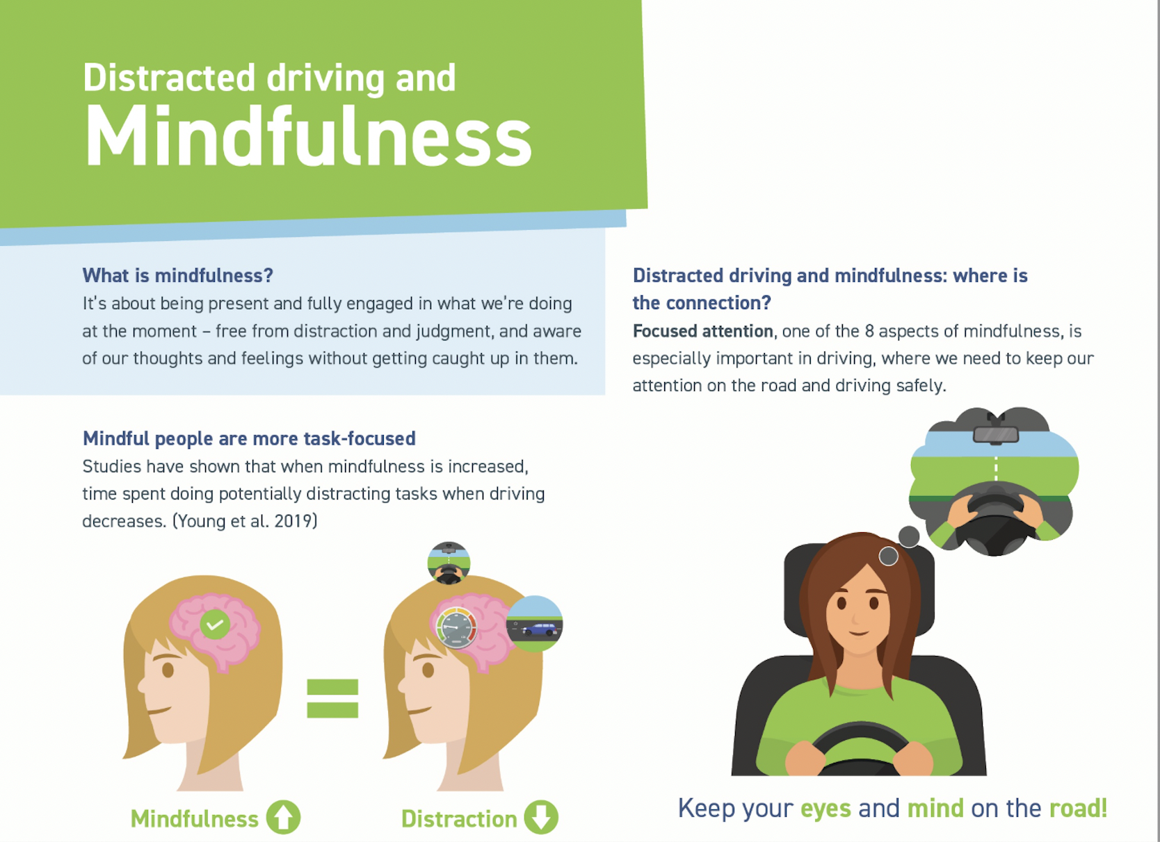
Visual imagery and contrast further strengthen the persuasive effect by transforming abstract mental processes into concrete, visible differences. The side-by-side illustrations of a driver’s brain under “mindfulness” versus “distraction” create a deliberate visual comparison, allowing viewers to immediately perceive the contrast without relying solely on written explanation. This juxtaposition emphasizes the binary opposition between focus and chaos, visually reinforcing the central argument that attention leads to safety while distraction leads to danger.
The use of calming green and blue tones symbolizes safety, stability, and control, while the cluttered icons representing distractions suggest mental overload. This strategic use of color symbolism creates a subtle appeal to pathos, encouraging viewers to associate mindfulness with calm confidence and distraction with stress or risk. Additionally, by turning complex psychological concepts into simplified diagrams and relatable icons, the infographic uses visual simplification to make the message easier to process and remember. As a result, the imagery not only supports the written claims but deepens their emotional and cognitive impact, increasing both engagement and persuasion.
Overall, through its strategic use of cause-and-effect reasoning, simple diction, visual imagery, contrast, and appeals to logos and pathos, the infographic effectively promotes mindfulness as a proactive approach to safer driving. However, the infographic’s effectiveness may be limited by its heavy reliance on simplification and its relatively restrained emotional appeal. By presenting mindfulness as an easily adoptable solution, it may underrepresent the complexity of real-world driving habits. Some drivers, particularly those skeptical of mindfulness practices, may not find the argument fully convincing without stronger statistical evidence or emotional urgency.