
Author’s Intention
Teach students that author’s intention is what the creator wants the audience to think, feel or do, not simply what a device does. In a multimodal advertisement, this includes visual and structural choices as well as language.
1. Start with the text’s overall purpose
Before identifying devices, ask:
Who is the intended audience?
What is the text trying to achieve?
What does the advertiser want the audience to think, feel or do?
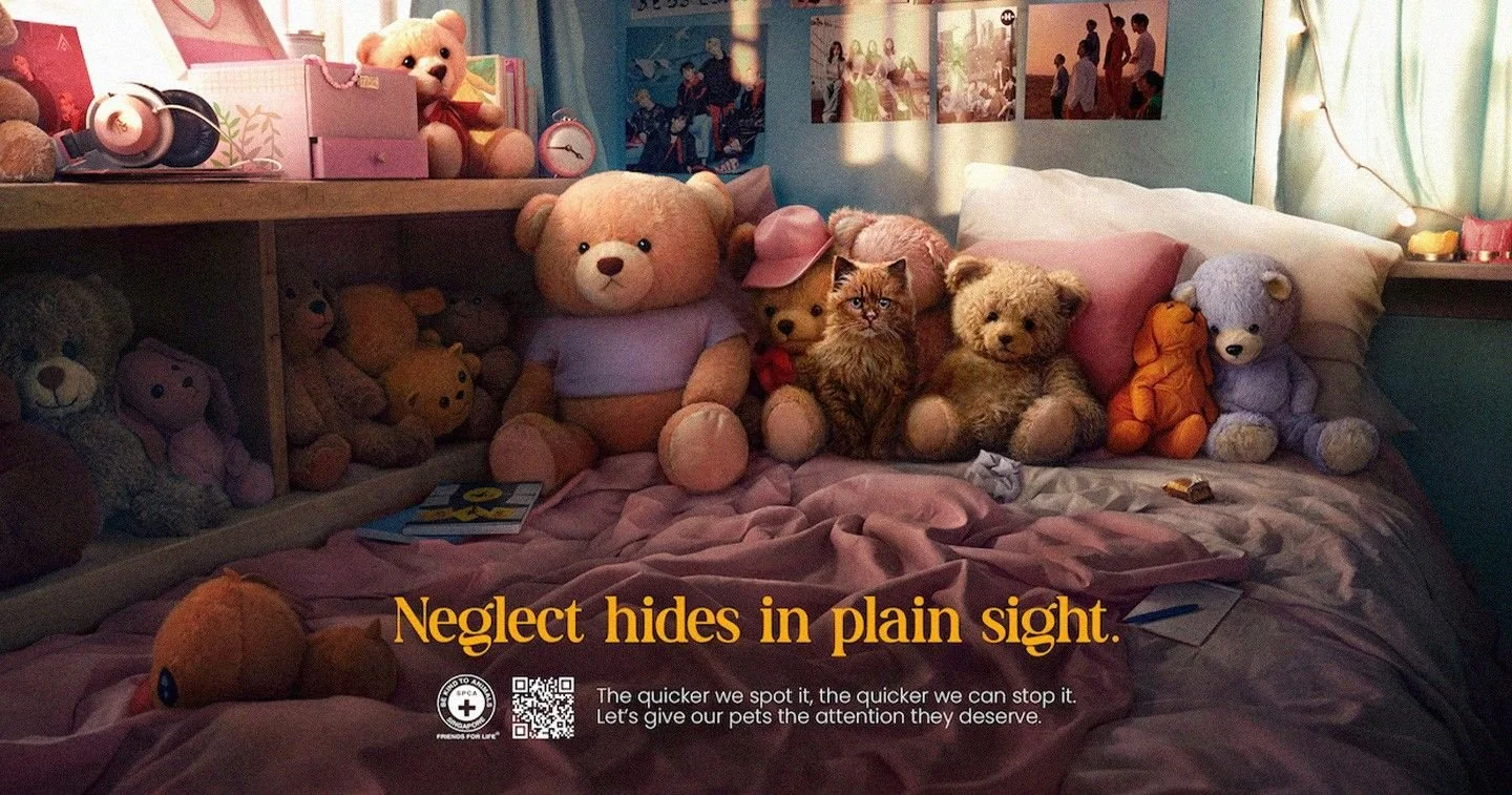
For this SPCA advertisement, the intended audience includes pet owners and the wider public. Its purpose is to raise awareness of overlooked animal neglect and persuade people to give pets attentive, responsible care. It challenges the assumption that a comfortable home necessarily guarantees an animal’s welfare.
2. Teach a three-step chain
Give students this structure:
Choice → effect on the reader → link to the advertiser’s purpose
For example:
Choice: The headline personifies neglect as something that “hides.”
Effect: Neglect appears elusive and easy to overlook, even in familiar surroundings.
Intention: The advertiser prompts viewers to scrutinise apparently reassuring environments and pay closer attention to pets’ needs.
Ask students:
How does “hides” characterise neglect?
Why might the advertiser want neglect to appear difficult to detect?
How does this connect to the cat blending into the surrounding toys?
The strongest analysis connects the language to the image rather than treating each device in isolation.
3. Connect intention to effectiveness and limitations
Ask students whether a choice is likely to achieve its intended purpose, and why.
For example, the CGI composition visually camouflages the cat among teddy bears. Viewers who initially overlook it may experience the inattention the advertisement criticises. This makes the warning personally relevant and supports the intention to increase awareness of easily missed animal needs.
However, the constructed image is a metaphor, not evidence that the depicted cat is neglected. The supporting text also gives little practical guidance about recognising neglect. Students can therefore argue that the advertisement is more effective at raising awareness than at explaining how to intervene.
4. Give students a sentence scaffold
By using [device/choice] in [quotation or visual detail], the advertiser presents [idea] as [quality]. This may lead the audience to [think/feel/do], helping the advertiser to [overall purpose].
Example:
By personifying neglect as something that “hides,” the advertiser presents it as easily overlooked rather than always obvious. This may lead viewers to question whether a comfortable home guarantees adequate care, helping the SPCA to promote closer attention to pets’ needs.
For evaluation, add:
This is effective because [specific reason], although [limitation].
Example:
This is effective because the cat’s visual camouflage allows viewers to experience overlooking an animal, although the image alone does not explain how to identify actual neglect.
5. Use a “weak to strong” comparison
Ask students which answer is stronger and why.
Weak
The advertiser uses personification to interest the reader.
Better
The advertiser uses personification to make neglect seem hidden and difficult to detect.
Strong
By presenting neglect as something that “hides in plain sight,” the advertiser challenges the belief that mistreatment is always obvious and urges viewers to examine their pets’ care more closely. The cat’s camouflage reinforces this message by allowing viewers to experience the oversight themselves.
The strongest answer explains why the choice is useful in this particular advertisement, links language and visuals, and supports its evaluation with evidence.
6. Practise with “think, feel, do”
Have pairs complete these prompts for one quotation or visual detail:
The advertiser wants viewers to think that…
The advertiser wants viewers to feel…
The advertiser wants viewers to do…
For “Let’s give our pets the attention they deserve,” possible responses include:
Think: Pets are entitled to attentive care, not merely a comfortable place to live.
Feel: A shared sense of responsibility for animal welfare.
Do: Pay closer attention to their pets’ needs and seek further guidance where necessary.
Students do not need to use all three in their final answer. These prompts help them explore plausible intentions without forcing unsupported emotional responses.
Key reminder
A device does not have one fixed intention. Personification might entertain, alarm or persuade depending on the context. Students should use phrases such as “suggests,” “aims to” or “may prompt” and support their interpretation with evidence rather than claiming to know the advertiser’s thoughts.
For the essay’s three body paragraphs, apply the same chain to visuals, language and structure, evaluating how effectively each supports the campaign’s purpose.
Practice Paper & Essay Response
Click here for the original text.
Guiding Question: How do visual, textual, and structural choices help to convey the advertisement’s purpose?
Essay Response
Animal neglect is often associated with abandonment or visibly harsh conditions. This SPCA public-service advertisement challenges that assumption by placing a real cat among stuffed animals in an apparently comfortable bedroom. The headline, “Neglect hides in plain sight,” invites viewers to reconsider a scene that initially appears reassuring. Addressing pet owners and the wider public, the advertisement suggests that providing a home does not necessarily mean providing adequate care. Through its visual concealment of the cat, persuasive language and carefully organised structure, it urges viewers to recognise overlooked needs and give pets the attention they deserve.
The advertisement’s visuals establish an atmosphere of comfort while exposing how easily an animal can be overlooked within it. The warm lighting and pastel colour palette, evident in the pink bedding and soft cushions, create associations with affection and security. These comforting visual choices challenge the expectation that neglect occurs only in visibly hostile environments, prompting viewers to question whether appearances reliably indicate adequate care. At the centre of this setting, the cat’s brown colouring, furry texture and seated position create visual camouflage among the teddy bears. This resemblance makes the viewer’s own attention part of the advertisement’s argument: although the animal is plainly visible, it may not immediately be recognised as distinct from the objects around it. The technique is particularly effective because viewers may experience the very oversight the advertiser wants them to prevent. Once noticed, the cat’s direct gaze establishes a connection with the audience, inviting them to recognise it as a living creature with needs. Its placement beside the toys also creates juxtaposition, contrasting an animal requiring sustained care with possessions requiring none. This contrast suggests the danger of treating pets as decorative objects, challenging owners to reconsider whether they attend to their animals’ needs rather than simply enjoy their presence. The image does not establish neglect through clear evidence of mistreatment; instead, the arrangement functions as a visual metaphor for inattention, supporting the advertiser’s intention to expose neglect within apparently reassuring surroundings.
This visual experience of overlooking the cat is given explicit meaning through the advertisement’s language. The headline, “Neglect hides in plain sight,” uses paradox to emphasise that seeing an animal is not the same as recognising its needs. The contradiction between concealment and visibility is effective because it reflects the viewer’s possible failure to notice the centrally positioned cat, calling for greater scrutiny of familiar environments. Within the same phrase, the personification of neglect as something that “hides” makes it seem elusive, while “plain sight” suggests that its concealment may result from human inattention rather than physical invisibility. Together, these devices push viewers to reconsider both the CGI and their habits of observation. The supporting sentence, “The quicker we spot it, the quicker we can stop it,” then shifts from warning to reassurance. Its parallelism, through the repeated construction “the quicker we,” links early recognition with intervention and creates urgency, urging the audience to act promptly. The rhyme between “spot” and “stop” reinforces this connection through sound, making the proposed relationship memorable and persuading viewers to see detection as a step towards prevention. Meanwhile, the modal verb “can” communicates possibility rather than certainty, reassuring viewers that their attention could make a difference. The inclusive pronoun “we” invites the audience to share responsibility rather than feel individually accused. This cooperative tone continues in the hortative expression “Let’s give our pets the attention they deserve,” which calls for shared action. The evaluative verb “deserve” frames care as an entitlement rather than an optional kindness, appealing to the audience’s sense of moral responsibility. Crucially, the double meaning of “attention” connects noticing the hidden cat with providing sustained care, asking viewers to move beyond observation towards responsible care.
The structure develops this appeal by guiding viewers from observation to recognition and then towards action. The CGI’s dominance establishes a visual hierarchy, allowing the audience to encounter the bedroom’s apparent comfort before interpreting its implications. By prioritising the scene over explanation, the advertiser gives viewers the opportunity to overlook the cat, aiming to make the subsequent warning personally relevant. The headline’s large typography and contrasting yellow colour then establish it as the principal verbal message against the darker bedding. This prominence directs viewers towards the warning and invites them to reinterpret the CGI. The resulting image–text interplay prompts viewers who initially miss the cat to look again, fostering the greater awareness that the campaign seeks beyond the advertisement. Beneath this warning, the smaller supporting text creates a problem–solution sequence: the headline identifies hidden neglect, while the sentences below present recognition and attention as responses. This progression is persuasive because it seeks to replace potential unease with a constructive sense of responsibility. Finally, the SPCA logo provides an appeal to institutional credibility, identifying an animal-welfare organisation behind the message and building viewers’ trust in its guidance. The adjacent QR code functions as a call to action, offering a practical route to draw viewers into further engagement without overcrowding the composition. Through this ordered movement from image to warning, explanation and response, the advertiser turns a moment of visual discovery into an invitation to take responsibility.
Ultimately, the public-service advertisement is effective because its constructed domestic scene challenges the assumption that a comfortable home necessarily guarantees adequate care, and the inclusive language invites shared responsibility rather than defensiveness. However, the digitally created image functions as a metaphor rather than evidence of actual neglect, prompting viewers to look more closely at their pets’ needs without fully explaining how to respond.